
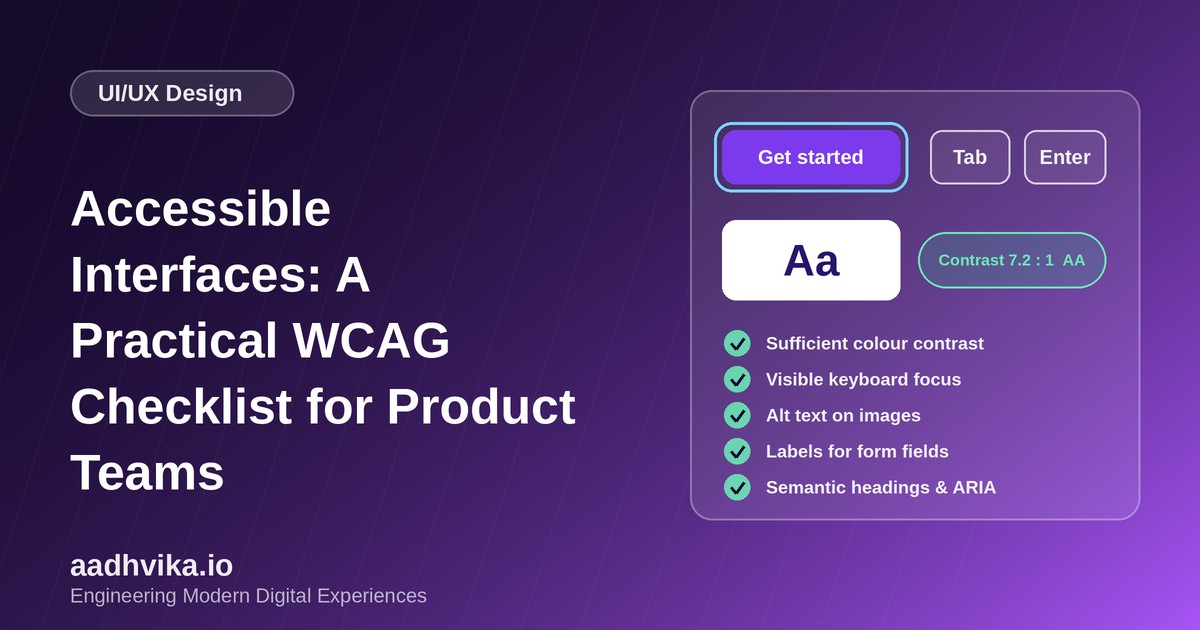
Accessibility often gets treated as a last-minute compliance task, but it is really a quality measure for your interface. Accessible products work for people with disabilities, people using a phone in bright sunlight, people with a broken trackpad and people who simply prefer the keyboard. They also tend to rank better and convert better. This checklist is based on the Web Content Accessibility Guidelines (WCAG) and is written for product teams, not specialists.
The four principles: POUR
WCAG is organised around four ideas: content must be Perceivable, Operable, Understandable and Robust. Everything below maps back to one of these.
1. Colour and contrast
- Body text needs a contrast ratio of at least 4.5:1 against its background (level AA). Large text needs at least 3:1.
- UI components such as input borders, icons and focus rings need at least 3:1 against adjacent colours.
- Never use colour as the only way to convey meaning. Pair red error states with an icon and a text message.
- Check both light and dark themes, since a palette that passes in one often fails in the other.
2. Keyboard navigation
- Every interactive element must be reachable and usable with the keyboard alone: Tab, Shift+Tab, Enter, Space and arrow keys.
- Keep the tab order logical and match the visual order.
- Show a clearly visible focus indicator. Never remove the outline without replacing it with something equally visible.
- Avoid keyboard traps, and make sure modals move focus inside when opened and return it when closed.
- Offer a "skip to main content" link for long navigation menus.
3. Forms
- Every input needs a visible, associated label. Placeholders are not labels.
- Explain errors in plain language, next to the field, and announce them to screen readers.
- Use the correct input types and autocomplete attributes so browsers and password managers can help.
- Mark required fields clearly and do not rely on colour alone.
4. Images, media and content
- Give meaningful images descriptive alt text, and use empty alt text for purely decorative ones.
- Provide captions for video and transcripts for audio.
- Avoid auto-playing media, and respect the reduced-motion preference for animations.
- Use plain, concise language and descriptive link text instead of "click here".
5. Semantics and ARIA
- Use real HTML elements first:
button,a,nav,main,h1toh6. They come with accessibility built in. - Use one
h1per page and keep heading levels in order. - Only add ARIA attributes when native HTML cannot do the job, such as for custom tabs, menus or dialogs.
- Set the page language and give each page a unique, descriptive title.
6. Touch targets and responsiveness
- Make touch targets at least 44 by 44 CSS pixels, with enough spacing around them.
- Support zoom up to 200 percent and reflow content without horizontal scrolling.
How to test
- Run automated checks with tools like Lighthouse, axe DevTools or WAVE to catch the easy issues.
- Navigate your key user flows using only the keyboard.
- Test with a screen reader such as NVDA, VoiceOver or TalkBack.
- Zoom to 200 percent and try the interface on a small phone screen.
- Include accessibility acceptance criteria in your design and QA definition of done.
Conclusion
You do not need to fix everything at once. Start with contrast, keyboard access and form labels, bake the checklist into your design system components, and improve steadily. Accessible components built once benefit every screen that uses them.