
A new user's first ten minutes decide whether your product becomes part of their week or another forgotten tab. Sign-ups are easy to celebrate, but they only matter if people reach the moment where the product proves its value. Onboarding is the design work that gets them there.
Start with the activation moment
Before designing any screen, define your activation event: the first action that predicts a user will stick around. For a project tool it might be creating a project and inviting a teammate. For an analytics product it might be connecting a data source and seeing a first chart. Every onboarding decision should shorten the path to that moment.
Measure time to value
Time to value is how long it takes a new user to reach the activation event. Track it from sign-up to activation and look at where people drop off. A funnel with a clear step-by-step view will show you the one screen that loses half your users, and that is where to spend your effort first.
Ask for less at sign-up
- Ask only for what you need to start: an email and a sign-in method.
- Defer profile details, billing and team settings until they matter.
- Offer social sign-in to remove password friction.
- Use one or two questions to personalise the experience, such as the user's role or goal, rather than a long form.
Replace empty states with guidance
An empty dashboard is a dead end. Turn every empty state into a prompt: a short explanation, a single clear action, and sample data or a template so the user can see what good looks like. A preloaded demo project often teaches more than any tour.
Use checklists, not walls of tooltips
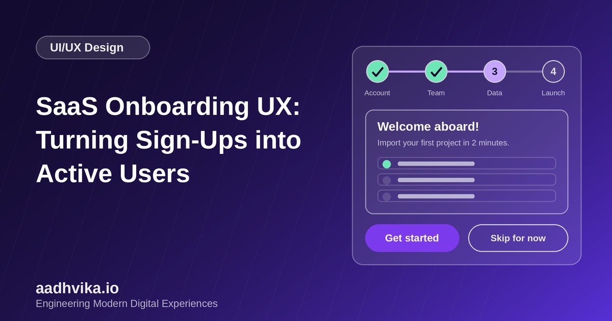
A short checklist of three to five tasks gives users a visible goal and a sense of progress. Tick items off automatically when the user completes them, and celebrate the last one. Product tours that block the screen with a dozen tooltips are usually skipped, so keep any tour to a few steps and always let users dismiss it.
Progressive disclosure
Show the core features first and reveal advanced ones as users are ready for them. Contextual hints that appear when a feature is first relevant work better than an upfront lecture. This keeps the interface calm and lowers the cognitive load for new users.
Help people who get stuck
- Put a help option and live chat within reach at every step.
- Send a short email sequence triggered by behaviour, such as a nudge if the user has not invited a teammate after two days.
- Offer a fast human path for high-value accounts, such as a quick onboarding call.
Design for accessibility and mobile
Onboarding screens are often the first thing users see on a phone. Make buttons large, forms short and error messages specific, and make sure every step works with a keyboard and screen reader.
Metrics to watch
- Activation rate: the share of sign-ups who reach the activation event.
- Time to value: the median time to that event.
- Week-one retention: how many users return within seven days.
- Checklist completion rate and the step with the largest drop-off.
Conclusion
Good onboarding is not a tour. It is a short, guided path to a real result. Define activation, cut everything that delays it, guide users through empty states, and measure every step. Small changes here compound across every customer you ever sign up.