
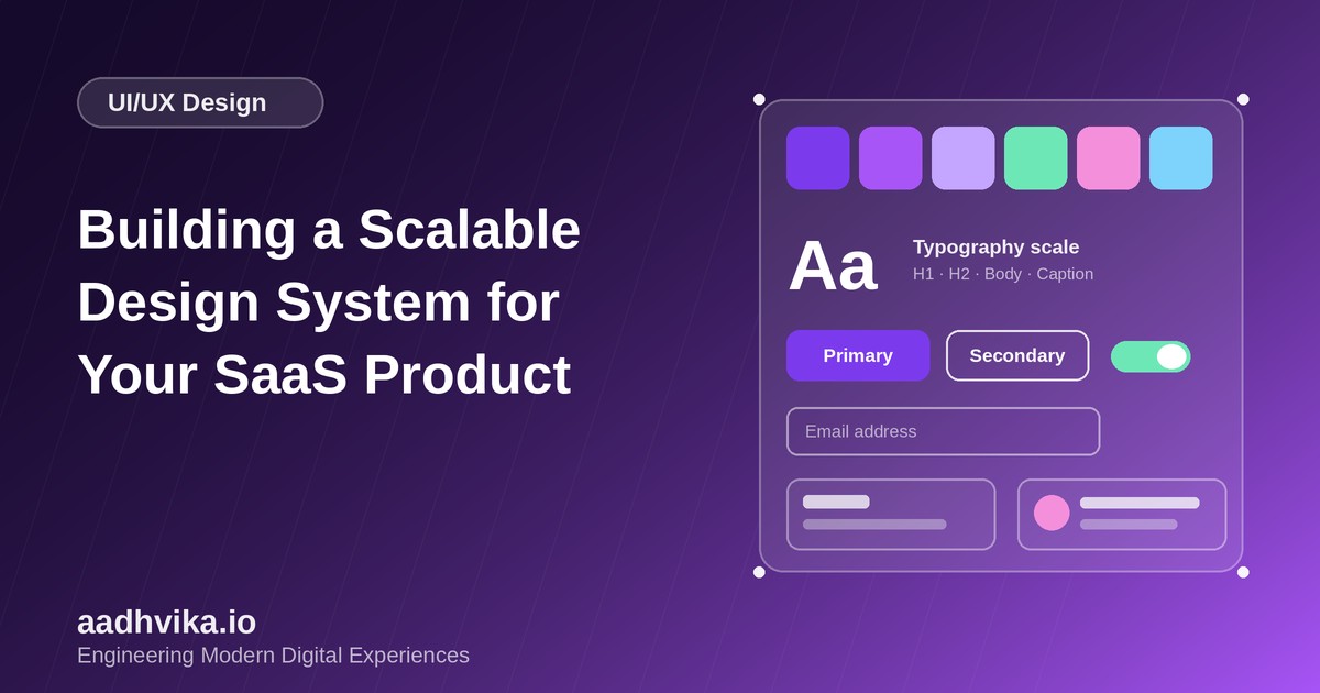
A SaaS product rarely stays small. New features, new engineers and new designers quickly lead to five slightly different blues, three button styles and a UI that feels stitched together. A design system solves this by giving everyone a shared, reusable language for building interfaces, so the product feels consistent and teams ship faster.
What a design system actually contains
A design system is more than a Figma file or a component library. It combines design principles, reusable UI components, design tokens, usage guidelines and the code that implements them, all kept in sync.
Step 1: Start with design tokens
Design tokens are the named values behind your visual style: colours, spacing, font sizes, radii, shadows and motion. Instead of hard-coding #7C3AED in fifty places, you define color-primary-600 once and reference it everywhere. Changing your brand or adding dark mode then becomes a token change rather than a redesign.
- Use a small, purposeful colour scale (for example 50 to 900) plus semantic names such as success, warning and danger.
- Define a spacing scale based on a 4px or 8px grid.
- Limit typography to a clear scale for headings, body and captions.
Step 2: Build atomic, composable components
Build from the smallest pieces up: buttons, inputs, badges and icons first, then combine them into cards, forms, tables and navigation. Each component should have clear props, defined states (default, hover, focus, disabled, error, loading) and built-in accessibility such as keyboard support, focus rings and correct ARIA attributes.
Step 3: Keep design and code in sync
The biggest reason design systems fail is drift between the design file and the codebase. Export tokens from a single source of truth and consume them in both places. In React projects, pairing a headless component library with Tailwind CSS and a token layer works well, and Storybook gives you a living catalogue with visual regression tests.
Step 4: Document usage, not just appearance
For every component, document when to use it, when not to, content guidelines and accessibility notes. Good documentation reduces support questions and stops teams from inventing one-off variants.
Step 5: Govern and evolve
- Assign owners so the system has someone accountable for quality.
- Version releases and publish changelogs so product teams can upgrade safely.
- Create a lightweight contribution process for new components and variants.
- Audit real product screens regularly to find inconsistencies and unused components.
Conclusion
You do not need a huge system on day one. Start with tokens and your ten most-used components, apply them to real screens, and grow the system alongside the product. The payoff is faster delivery, fewer UI bugs and an experience that feels intentional to your customers.